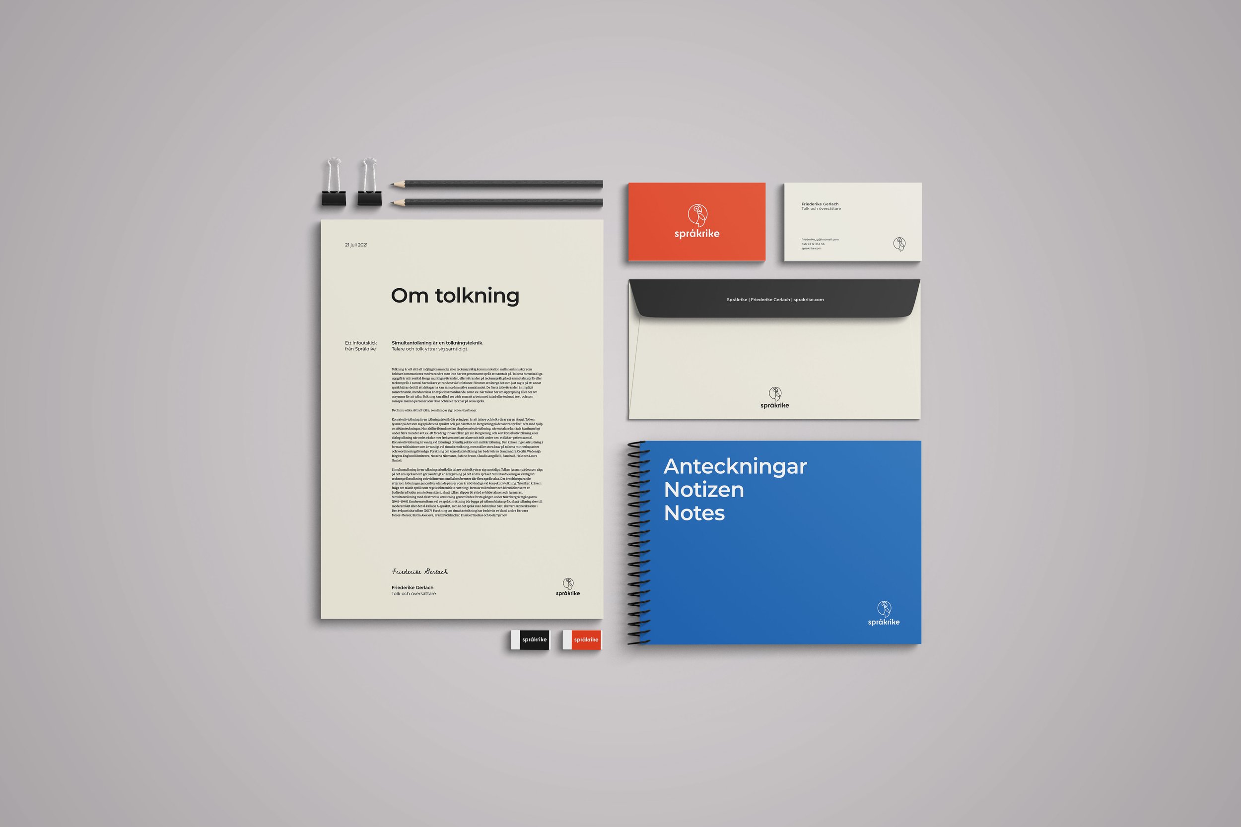
Logo and visual identity for Språkrike
Client: Friederike Gerlach, who in her work as a translator and interpreter goes under the name ‘Språkrike’.
I wanted Språkrike's graphic profile to be perceived as serious as the majority of her clients are authorities and organisations. At the same time, it was important that the material wouldn’t be perceived as boring, as interpretation is also a social and outward-oriented work.


To balance serious with outgoing and fun, the following was developed:
Clear typography that feels serious, but at the same time dares to stand out.
A symbol/avatar that in a witty way associates to interpretation.
Recommendations regarding imagery and image use.
Icons and speech bubbles.
Color palette with black and off-white, blue and orange. The idea with this color choice was to balance the serious with the more extroverted and outgoing side of being an interpreter. As Språkrike interprets between Swedish/English and German, I wanted to make a visual reference to that in the choice of the colors, without making it too obvious.


Example images. From Unsplash.